Client: ![]()
Usability improvements & KPIs
Team lead: Kelly Knickerbocker
Methodology
After diagnosing usability barriers, our team has identified methods by which Lightspeed can improve content performance for users. We’ve expanded on our previous recommendations, while also establishing key performance indicators (KPIs) that provide a framework for measuring progress toward addressing usability issues. Importantly, Lightspeed should consider gathering analytics and conducting research of the current state for each KPI in order to establish a baseline for evaluating progress.
Information architecture recommendations refined
To increase ease-of-use for all of Lightspeed’s web visitors, we suggest the following updates to the site’s information architecture:
Content category standardization
The content categories included in the main navigation and the footer are inconsistent, including when referring to the same piece of content. For example, in the main nav, “Resources” is where whitepapers, videos and customer stories live. In the footer, those items are included under a heading called “Learn.” To avoid confusion, ensure that all content categories are standardized across the organization and catalogued for quick reference.
Consistent ordering of navigation options
The main nav and the footer contain many of the same menu options, but are ordered differently on the page. For example, “About” is the second to last menu option along the main nav, but the first menu option along the footer. For a consistent user experience, the options in both areas should be consistent.


Consistent subnav options
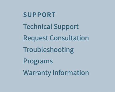
In addition to standardizing content categories and nav menu ordering, subnav items should mirror each other in the main nav and footer. For example, in the main nav, “About” has no secondary drop-down sections listed. In the footer, “About” has five sub-sections listed. Similarly, “Support” in the main nav includes a FAQ subnav option, while FAQ is not listed under “Support” in the footer.
Main nav

Footer
Layout of sticky nav menu
As web visitors scroll through any page on the Lightspeed website, a sticky version of the main nav bar stays fixed along the top. This is a helpful usability feature that prevents visitors from needing to scroll back to the top of a page before continuing on to explore other sections of the site. However, the layout of this fixed nav could be confusing, as “Contact” appears directly to the left of a search magnifying glass—where you typically see a search field. Consider moving “Contact” to the left alongside the other menu options.

“Products” vs. “Shop”
For website visitors, the difference between “Products” and “Shop”—both options along the main nav—may not be apparent. We suggest combining both product specs and sales details under one main nav option called “Solutions.” On that page, we believe a comparison tool to evaluate Lightspeed’s offerings alongside each other would be especially helpful for a specific use case.
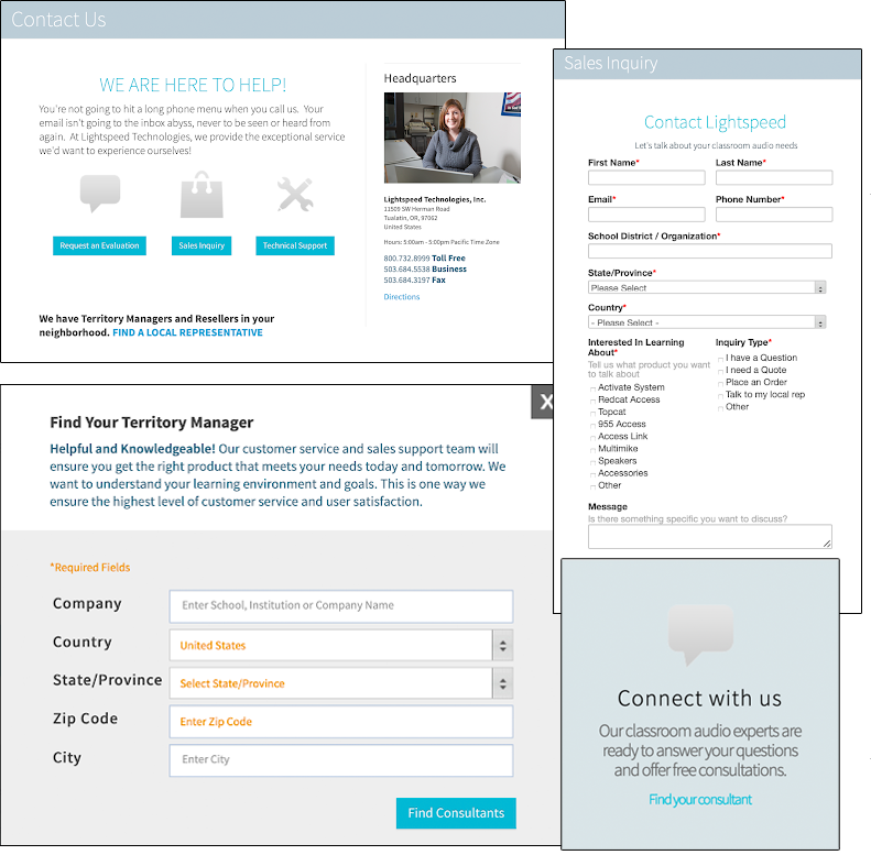
Addressing mixed messages around contacting Lightspeed
On the homepage, visitors may be overwhelmed by the number of invitations to connect with Lightspeed—especially if they’re not at a point where reaching out is appropriate. More complicated is that the invitations to connect lead users down different paths:
- Once on the Contact page, users are prompted to choose between requesting an evaluation, submitting a sales inquiry, asking for technical support or finding their local Lightspeed rep; all options lead to separate form fill pages
- On the Sales Consultants page, users can either contact sales or find a rep; both lead to separate form fills
To avoid confusion, consider streamlining Lightspeed’s contact page and the avenues people are given to arrive there. Add “Contact Us” to the main nav for visibility, and use that as an opportunity to remove some of the duplicate links across the page.
Multiple contact forms
Simplify and streamline the navigation
The Lightspeed website’s main navigation and footer are difficult to navigate and have content cross-listed in multiple areas. To simplify the user journey and make it easier to find useful, relevant information, we propose a restructure of both nav menus. The proposed main nav and footer structures also take into account all previous IA suggestions outlined above.
Proposed website main/header navigation
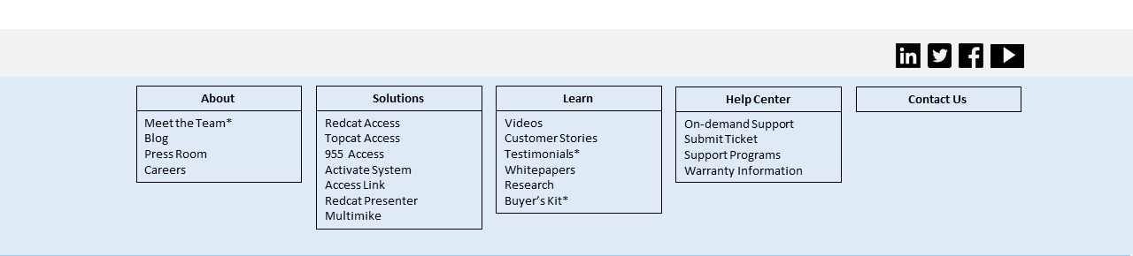
Proposed website footer structure
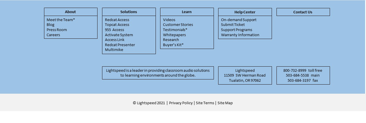 *Indicates suggested subnav menu option that does not currently exist on the website
Proposed navigation Accessible alternative
Header and footer
- About
- Meet the Team*
- Blog
- Press Room
- Careers
- Solutions
- Redcat Access
- Topcat Access
- 955 Access
- Activate System
- Access Link
- Redcat Presenter
- Multimike
- Resources
- Videos
- Customer Stories
- Testimonials*
- Whitepapers
- Research
- Buyer’s Kit*
- Help Center
- On-Demand Support
- Submit Ticket
- Support Programs
- Warranty Programs
- Contact Us
*Indicates suggested subnav menu option that does not currently exist on the website
Footer only
- Lightspeed is a leader in providing classroom audio solutions to learning environments around the globe.
- Lightspeed, 11509 SW Herman Road, Tualatin, OR 97062
- 800-732-8999 toll free, 503-684-5538 main, 503-684-3197 fax
Key Performance Indicators (KPIs)
Based on our usability diagnosis.
| KPI | Type | Current | Target | Method | Measurement |
|---|---|---|---|---|---|
| The website is fully accessible | Behavioral; quantitative; attitudinal; qualitative | Homepage has 67 contrast errors and 19 formatting errors (using WAVE) | 100% compliance scores for automated accessibility tests; screen reader interactions are meaningful and effective | Add alt text where missing; improve alt text by making more descriptive; increase color contrast; convert data images to interactive visualizations | Automated accessibility audits; screen reader testing; usability testing |
| The website is optimized for social media engagement | Behavioral; quantitative | White space shown when homepage link posted on FB. | The website incorporates best practices for social media metadata | Add meta tags specific to for social media | Social media referrals and engagement |
| Search is easy to use and delivers predictable results | Behavioral; quantitative; attitudinal; qualitative | Search icon redirects to a dedicated page. Error shown by default. | Search is integrated into every page; search results are predictable and useful | Integrate search field into header | Overall use of search; search keywords and search results interactions; usability testing |
| Navigation is consistent and intuitive | Behavioral; quantitative; attitudinal; qualitative | Nav bar and footer items are not consistent. | Navigation and sub-navigation is organized according to user expectations | Apply consistent terms for navigation items and categories | Behavior flow chart; card sorting and/or tree testing with users |