Client: ![]()
Usability diagnosis
Team lead: Kate Shevchenko
Methodology
We used several trusted accessibility audit tools, including Wave, WebAIM, and Lighthouse to audit for accessibility issues. Automated tools are helpful, but they are limited in usefulness. For example, they can assess if alt text (alternative text for images) is present, but they can’t evaluate whether or not the alt text is accurate, comprehensive, or useful. Consequently, we manually inspected alt text with Chrome’s built-in web inspector. We also manually inspected the page for style inconsistencies, grammar, content structure, and visual qualities.
Website usability diagnosis
The nounTown team has identified opportunities for Lightspeed to improve content usability on its homepage. We’ve organized our analysis under three general categories:
- Accessibility
- Search
- Information architecture
Accessibility
Issue
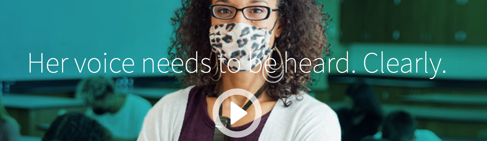
The Lightspeed homepage contains several excellent images that align with the brand’s unique product line and mission. However, several of the images create barriers for some users, primarily because of missing or insufficient alt text.
Alt text, or alternative text, is a written description of an image that enables users of screen readers or other assistive technologies to access the purpose and meaning of images on a website. More effective alt text also promotes better search engine optimization (SEO), as search engines use alt text (among other attributes) to index and organize images.
Example
Here is one of several opportunities that Lightspeed should explore to improve the application of alt text on the company’s homepage:
Recommendation
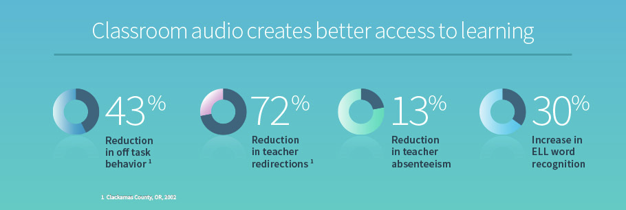
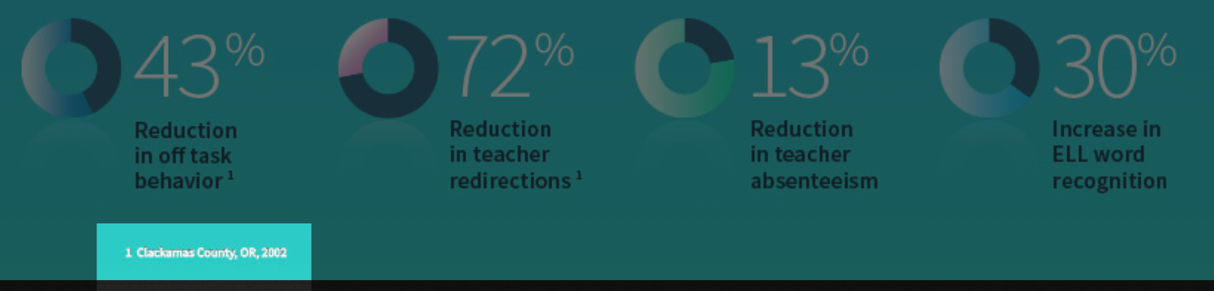
This a compelling image that demonstrates Lightspeed’s positive impact for teachers and students, but the data conveyed is only available to sighted users. The current alt text for this graphic is, “classroom audio stats.”
In the shorter-term, Lightspeed should consider implementing descriptive alt text across images on its website. For this example, that could be something similar to, “Classroom audio creates better access to learning, with 43 percent reduction in off-task behavior, 72 percent reduction in teacher redirections, 13 percent reduction in teacher absenteeism, and 30 percent increase in ELL word recognition, data collected in Clackamas County, 2002.”
Over the longer-term, Lightspeed should consider using HTML/CSS or SVG for this content, since many screen readers will stop reading alt text after 125 characters. Below is a prototype to demonstrate a more accessible technique for data visualization that is completely accessible to assistive technologies. Though it would take longer to implement, we recommend Lightspeed explore a similar option in the future employing their brand and style to a production version.
Accessible alternative
Here is an alternative using just HTML and CSS. All of the text is available to assistive technologies. This is a prototype to demonstrate a more accessible technique for data visualization. We recommend employing Lightspeed’s brand styling, and conducting accessibility audits and user testing.
prototype
Classroom audio creates better access to learning
43% Reduction in off-task behavior1
72% Reduction in teacher redirections1
13% Reduction in teacher absenteeism
30% Increase in ELL word recognition
1 Clackamas County, Oregon, 2002
Search
Issue
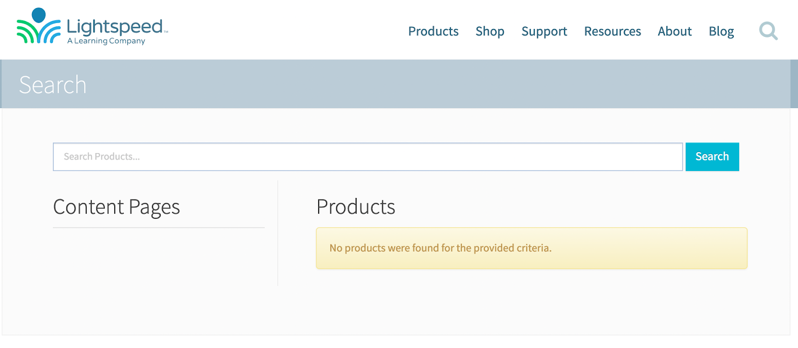
Search functionality on the Lightspeed homepage presents a usability barrier. Simply by clicking on the magnifying glass option on the main nav, visitors are routed to a separate page with an alert that reads, “No products were found for the provided criteria.” Web users get this alert before they’ve been given an opportunity to enter a search query.
This interaction could discourage users from continued engagement with the site and its content. It may also confuse users by making them think the latter was the result of something they did incorrectly. Either outcome is detrimental to Lightspeed’s goal of turning web traffic into prospects and, eventually, customers.
Additionally, the search landing page clearly distinguishes between content pages and products, yet the alert placeholder text implies the user is confined to a search for products. The search placeholder text could alienate users who are discovering the brand for the first time or users who are seeking support, training, research, press, careers, or several other types of content they might not immediately associate with “products.”
Recommendation
In the shorter-term, we recommend removing the default alert text users see when they land on the search page. When the user does enter a search for which there are no results, we see value in updating the alert text to an active voice. The active voice builds trust and implies accountability and aligns with voice and tone characteristics we previously recommended (caring, respectful). Consider an alternative, such as: “We couldn’t find what you’re looking for. Please let us know if we’re missing something.” Importantly, also provide the preferred way for the user to contact you.
In the longer-term, and if there is budget, we recommend the addition of an integrated search bar on the homepage. Right now, search is a three-step process for users (click magnifying glass, navigate to search lander, enter query, get results). With an integrated search, Lightspeed could eliminate one step entirely to create a more seamless on-page experience (click magnifying glass, enter query in integrated search bar, get results specific to user’s query). See the search field on this site for an example of integrated search (this one includes type-ahead, which populates search results as you type).
Information architecture
Issue
We’ve noticed some inconsistencies on the homepage in how content is organized. We believe this could confuse Lightspeed’s website visitors.
Examples
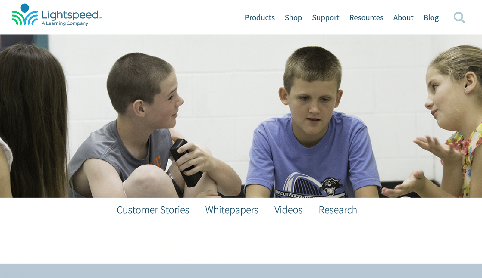
At the bottom of the homepage, the “See the research” callout box links to a page with no research listed. Instead of offering any content, research or otherwise, users are routed to a landing page consisting of links only. One of the four links is “Research.” The correlation between “Research” and the other, more marketing-focused options (“Customer Stories,” Whitepapers,” and “Videos”) is unclear.
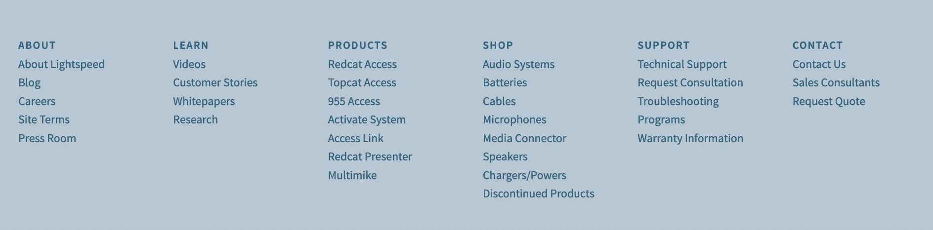
Another example is that the homepage’s main navigation menu options are different from the navigation options listed in the footer and they are in a different order. E.g., In the main navigation menu, “Resources” contains whitepapers, videos, stories, and resources. In the footer, those items are nested under a heading called “Learn”.

Recommendation
We recommend establishing consistency in the way Lightspeed refers to content categories and content types. Further, we recommend documenting how Lightspeed will organize and refer to content categories and content types. Addressing both of these areas, and similar issues across the site, Lightspeed can make their website easier and more logical to navigate through for all visitors.
Additional considerations
Insufficient color contrast issues may present barriers for some users
Our automated accessibility audit revealed 67 color contrast errors on the homepage. Insufficient contrast can make the content difficult to read or interpret for color blind and visually impaired users.
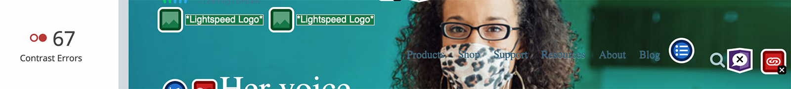
Text overlaid on background images can be difficult to read
Text on top of images can be difficult to read, particularly if the font is thin or fine. This can be resolved, in part at least, by lowering the contrast on the background image and increasing the weight of the font.
Featured data on the homepage is from 2002. Consider updating to support your brand characteristics of innovative and informative
Out-of-date data can undermine its own purpose; it can erode trust in your brand. If users don’t think the data is relevant, it may result in the opposite effect of what was intended.
Usability improvements & KPIs →